Wednesday 20 October 2010

Questionnaire

I created this questionnaire on Microsoft Word, in order to conduct research into my target audience, helping me to gain insight into what they really want out of a rock/metal music magazine. On my questionnaire, I asked 12 questions, which will all help me decide what content, name & price to have for my music magazine.
The questions featured are as follows: 1) Who is your favourite band? 2) What are three words you associate with rock/metal music? 3) What is your favourite colour? 4)How often are you willing to buy a music magazine? 5) What do you like about magazines of the rock/metal genre that you have read? 6) What do you dislike about magazines of the rock/metal genre? 7) How important, on a scale of 1 to 5, 5 being very and 1 being useless, is audience feedback (i.e. letters) in a magazine? 8) Would you be more interested in the magazine if there are special offers inside it? 9) Are you interested in reading about new bands/singers?10) Would it be useful for you to have reviews of new albums in the magazine? 11) Are interesting and varied pictures important to you in a magazine? 12) Would it be useful for you to have reviews of other media in the magazine? (Film, TV)           


Audio answers - these are two of my audio recorded answers to the questionnaire

Monday 18 October 2010

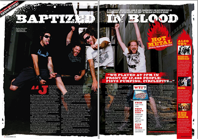
Analysis of Double Page Spread Articles


* There is a simple colour scheme of black, white and red. There is also a little yellow although not a lot.
* There is one picture which takes up the whole double page (with all the text on the picture) and bleeds between pages, which is used to link the two pages together.
* A quote is used just before the article continues on the second page, this helps to break up the text.
* There is a standfirst which introduces the article and is positioned under the start of the headline.
* A drop capital is used at the start of the article, in order to show the reader where to start reading. Techniques which are used in other magazines include bold text for the first word of the article, slightly bigger typeface or capitals for the first few letters.
* The headline uses a stylized font, and is used to draw the reader in, however, not telling them what the article is about, which is actually the job of the standfirst.
* There is no by-line on this article, however there usually is one on double page spread articles, stating who wrote the article and photographer's credit.
* There is a strapline in the top left corner telling the reader the subject matter of the article. In this case the strapline suggests that this article is news about an up-and-coming band.
* The article is written informally, and the personality of the journalist shows through.

Analysis of Professional Contents Pages


Analysis of Professional Magazine Covers

Tuesday 12 October 2010

Initial Plans for my Magazine

Price: £3.50
Frequency of publication:  monthly
Issue Size: 100 pages
Regular content:  letters, reviews of new albums, new releases, gigs and tour dates, letters from readers.
Feature articles:  interviews, reviews of concerts, news

Monday 11 October 2010

Researching the Market Place

KERRANG MAGAZINE
Kerrang! is a rock music magazine published by Bauer Consumer Media in the United Kingdom. The magazine's name is onomatopoeic and refers to the sound made when playing a power chord on an electric guitar.
Publisher website: www.bauermedia.co.uk
Price: £2.20
Frequency of publication: weekly
Issue size (number of pages): 71
Regular content: eviews of albums,  new album releases, gigs and tour dates, reviews on film, radio and TV, letters from readers.
Feature articles (issue depicted):  Iron Maiden and Trivium for UK mega tour, sex, drugs, violence:  Avenged Sevenfold – the world’s most dangerous band (main coverline), Red Hot Chilli Peppers:  Anthony Keidis on the ‘intense’ new album, Lost Prophets: How to survive rock n roll! Headbangers! 25 metal anthems you must own.

METAL HAMMER
Metal Hammer is a monthly heavy metal magazine published in the UK by Future Publishing, and in several other countries by different publishers. It features mainstream and more unusual bands from the wide spectrum of metal music. It is the largest selling metal music magazine in the UK currently outselling  Kerrang! And NME and is often viewed as the more underground magazine
Price: £4.25
Frequency of publication: Monthly
Issue size: 140 pages
Regular content: eviews of albums,  new album releases, gigs and tour dates, reviews on film, radio and TV, letters from readers.
Feature articles (depicted issue):  Out of the asylum! Disturbed, “Epic doesn’t begin to cover it!” The return of... Dimmu Borgir.

Initial Ideas

The type of music magazine I am going to produce is a rock/metal magazine. The target audience will be 16-25 year olds with an interest in rock/metal music.

Introduction - Main Task

For this I will create a front page, contents page, and double page spread article for a new and original music magazine. I will do this using Adobe Photoshop and Quark Xpress.
All images and text used will be original and produced by myself.

Evaluation

My school magazine uses many of the conventions of magazine front covers and contents pages, the title is one word and in the top centre of the page, however, it does not stick to the codes and conventions, as it is not a unique font .
Moreover, there is no positioning statement on my school magazine, which is usually used to convey how the magazine positions itself in the market place, therefore this is another way in which my school magazine challenges the conventions of real media products.
My magazine, however, does use the convention that the issue date and title must be near the title, moreover it is in 11pt size.
The main image, does associate with the main feature article, as has been made clear by the use of props and body language. Direct address is used with the main image, which is important for the front cover of magazines . However, it does not convey a certain attitude, or show something about the person pictured, but,  this may be to do with the genre of the magazine.
There is also a buzzword used on my front cover (EXCLUSIVE) which suggests that the reader cannot read this certain article in any other magazine, which is also a selling point.  However, this buzzword is not used for the main feature article, as is common on professional magazine front covers.
With the coverlines, the main coverline is the largest, as is usual in professional magazines, it also anchors the meaning of the main image.  They also consist of only one or two words, then with smaller writing (sublines) explaining a little bit more about the article.  This is also consistent across the design, and care has been taken to avoid the coverlines and sublines from covering any part of the main images face, as is correct in professional magazines.
On the contents page, there is 3 columns, 1 main picture and one other picture, relating to the coverlines . neither of these pictures are direct address , they also have page numbers on them showing the reference to an article. However the name of the magazine or its logo is not present with the word contents, which deviates from the codes and conventions of contents pages. 

I used Adobe Photoshop to create my front cover, and Quark Xpress to create my contents page. I used many different tools on these programmes, for example, colour filter, contrast and brightness adjustments, transform, effects such as 'drop shadow' and the crop tool on Photoshop. I imported pictures, added special effects to the title and imported text while using Quark Xpress. 

I think that I used all of the tools I used to create my front cover and contents page, in each programme, quite well, although I could have used some more advanced techniques to create a more effective and diverse piece of work. As a new media product, my piece does not quite fit to professional quality. There is much room for improvement, mainly in the area of following the codes and conventions for professional magazines, and the little use of special effects to make a more interesting and original product.

Final Front Cover and Contents Page

Changes from original design:
coverline ('SHOW TIME - get ready for our production of the Wizard of Oz!') to fill in some space on this front cover.

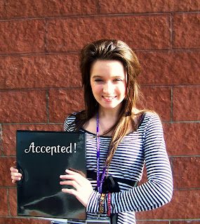
*  I didn't have time to create a document looking like an acceptance letter for the image, like I originally planned, therefore I added the text 'Accepted!' onto the folder instead, to connote that the acceptance letter is inside the folder.

*Originally I planned to take the photo outside the doors of the schools main entrance, however this was not possible, as people kept on needing to get in and out of the school, therefore I could not take an image of just my model there, and decided to take it by the walls of the school.

* I added the 'emboss' and 'drop shadow' effects to the title of my magazine, which was not originally planned.

Procedures:
* I opened a new file on photoshop, making sure an A4 letter was selected.
* I then opened my main image and dragged it onto the new file, then making it fit onto the A4 page without distortion.
* I then added my titile, using a text box, adding the effects 'emboss' and 'drop shadow' to it. I then made sure it was centred on the page.Next I coloured it so that it was the same colour as my models ID badge cord.
* I added the issue date and price, on the top right of the page, just above the titile in 10pt.
* I then wrote my coverlines and sublines, making sure the coverlines were the same colour as the titile. I also made sure that the coverlines and sublines framed the image, and did not go across any of the images face. Moreover, I made sure that the main coverline was the biggest, and that it anchored the image.
* Next I added the puff, using the shape tool, colouring it the same as the title, I added the text on top of it to advertise the competition.
* Finally, I added the bar code to the magazine, in the bottom right corner.

FINAL CONTENTS PAGE (Created with Quark Xpress)


Changes from original design:

* I only had two images on my contents page instead of the originally planned three, for two reasons; 1) They couldn't fit on the page with all the feature and regular content, 2) I could not get a picture of the school theatre at the time I took my pictures as it was in use.

* One extra feature article has been added, as with the front cover.

* I could not fit in the 'Help Page' and 'Funny Times' articles in the regular content, as there was no room for them.

* I added a 'drop shadow' effect to the title, which I did not originally plan to add.

* I cut my page into 3 columns instead of the original plan of 2.

* I did not add a 'subscribe' section on the bottom left of the page as originally planned, as there was no room for it.

* I did, however, add the 'Win a free memory stick' part, which related to the 'puff' on the front cover, also with a page reference so that readers can find the page on which the contest information is on.

Procedures -
* I opened a new project on Quark Xpress, and changed the number of columns from 1 to 3.
* I then added another page, along with the master page, to the project.
* Next, I wrote the title 'Contents' and made sure it spread across two columns.
* I then added my text, feature articles, and then regular content, by drawing a text box in columns 1 and 2.
* I changed the colour of my title and coverlines to the same purple as is on the front cover to connect the two.
* I added the drop shadow effect to the work 'Contents'.
* I then drew one picture box onto the 2nd and 3rd column, and a second onto just the 3rd column, then importing my two pictures into them, and making it so that the would fit in the boxes without distortion.
* I then added small texts boxes onto the bottom right hand corners of the pictures, and added a page reference number to them.
* I then added a final text box onto the bottom left of the page, in the third column to add a reference to the competition puff on the front cover.

Photoshop Screenshots

Manipulated, final image for front cover, put into an A4 photoshop file, with no title, coverlines, barcode etc.


Title has been added.


Coverlines and sublines have been added.

Bar code and puff has been added, front cover is finished.


Manipulated Images

Links to the main coverline ('HIGH FLYER - Year 13 student accepted into Cambridge).  It is taken by one of the walls of the school, and the subject is wearing a sixth form ID badge - this is to represent the school, so that it is apparent which school the magazine belongs to.

Manipulation - I edited the contrast and brightness of this image to give it a clearer, more radiant look. I also edited the colours, so that the picture looks warmer, and in a way 'happier' - relates to coverline, as student is happy she has been accepted into Cambridge.
Moreover I added text to the folder she is holding, saying 'Accepted!' in prestigious looking font, this also related to the coverline, and suggests that the folder she is holding contains her acceptance letter.
I also cropped the image, so it would fit to an A4 paper size without any distortion.


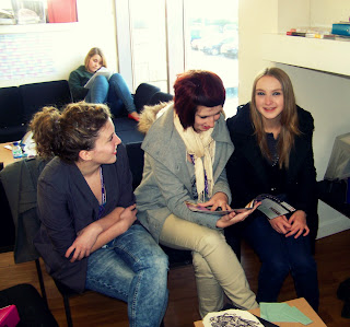
Links to coverline 'ECLUSIVE - the real story of life in the sixth form'

It is taken in the common room, of three sixth for students in their square which connotes sixth form life.
Moreover, one of the students is reading a school newsletter, which again represents the school, so the reader knows which school 'Acheive' belongs to.


Manipulation - Again, I edited the contrast and brightness, to give a cleaner, brighter look.
I also edited the colours so that the image has a more 'vintage' look, which in turn makes the photograph look less formal, warmer and more inviting - which suggests that the sixth form has a welcoming environment. I also cropped the image, to focus more onto the three sixth formers, rather than the square.

Links to coverline 'AIM HIGH - student gets straight A*'s in GCSE's'

Ideally, I would have taken a picture of an exam paper marked as A* level, however, none were available. I drew an A* sign on blank paper to connote the grades of this GCSE student, and just added it to a pile of things to connote working.

Manipulation - I cropped this image to focus more into the A* symbol. I also adjusted the contrast to give a 'cleaner' look to this photograph.

Non-manipulated Images


Front cover image.


Image for contents page.

Image for contents page.

Rough Layouts

Front Cover Original Design


Title - Centred conveying school life (achieve- you achieve qualifications, awards etc in school).

Main image - medium close-up, connects to main coverline (main coverline anchors image). School in background, again points out the type of magazine this is.

Coverlines & Sublines - 1-3 words long, catchy, make the reader want to find out more e.g. 'Back to School - Evening classes proposed for parents'. Also contains a buzzword in the coverline 'EXCLUSIVE- life in the sixth form'. Makes out that this magazine has articles that no other magazine has. (For full list of all coverlines and sublines, see the planned coverline list above).


Puff - there's a competition to win a memory stick, advertised on the bottom left of the page - is a selling point.

Colour Ideas - I did not colour my plan, however I think I will use the colour purple for the title and coverlines, as it connects to the colour of the sixth form ID badge in the school. The sublines will be in black. 


Contents Page Original Design


Two columns, one containing feature articles and the other regular articles & images relating to feature articles.

Images :
* School theatre with stage lighting on, which connects to the coverline 'HIT THE LIGHTS - professional lighting installed in the theatre'.
* Three sixth form students in their common room square, connects to coverline 'EXCLUSIVE - the real story of life in the sixth form'.
*GCSE exam paper, marked as an A*, connects to coverline 'AIM HIGH - student gets straight A*'s in GCSE's'.

There is also a small subscribe section on the bottom left of the page with information on how the reader can subscribe to the magazine.

Plans

FRONT COVER

Title: Achieve

Details of  mise-en-scene of main image: a medium close up of a sixth form student, relating to the main coverline ('High Flyer - year 13 student is accepted into Cambridge University'), background = outside main entrance or in school grounds.

Coverlines: 'AIM HIGH - student gets straight A*'s in GCSE's', 'HIGH FLYER - year 13 student accepted into Cambridge University', 'HIT THE LIGHTS - professional lighting is installed in the theatre', 'AMAZING!- year 10 student qualifies for the London 2012 Olympics', 'LONGER LUNCHTIME - plans to add an extra half hour', 'BACK TO SCHOOL - evening classes proposed for parents', 'AND THE WINNER IS... Teacher wins national award', 'EXCLUSIVE - the real story of life in the sixth form'.

CONTENT

REGULAR CONTENT: 
- Letters - from students, teachers etc to the magazine making suggestions/ giving their views on a previous article/ giving views of the school etc.
- Holiday Update - News on inset days planned, half term etc.
- Special Events This Month.
- Rewards Update - What new things the students can buy from the IRIS rewards system.
- Exciting Opportunities - Whats on offer to students within and outside the school to earn extra  credit/voluntary hours etc.
- Funny Times - funny stories of happenings in school by students and teachers.
- Helping Hand - an anonymous help page for students, provides counselling and advice from learning mentors/ school nurse / peer counselling.


FEATURES - see coverlines above.


IMAGES FOR CONTENT PAGE:
- picture of the theatre - showing off its new lighting.
- picture of the common room and happy looking group of sixth form students.
- picture of an A* graded GCSE paper.

Introduction - Preliminary Exercise

Using DTP and an image manipulation programme, I will produce the front page of a new school/college magazine, featuring a photograph of a student in medium close-up, plus some appropriatly laid out text and masthead. Additionally, I will produce a mock-up of the layout of the contents page to demonstrate my grasp of DTP. All images and text will be original, and produced by myself.