Thursday 7 April 2011

Final Production

Music Magazine Front Cover 


Music Magazine Contents Page


Double Page Spread Article 


School Magazine Front Cover 


School Magazine Contents Page


Thursday 3 March 2011

Q1. In what ways does your media product use and develop forms and conventions of a real media product?


Q2. 2. How does your media product represent particular social groups?


Q3. What kind of media institution might distribute your media product?

Q4. Who would be the audience for your media product?

Q5. How did you attract your audience?

embed code for Q5: Q5. How did you attract your audience?

Q6. What have you learnt about technologies from the process of constructing this product?


Q7. Looking back at the preliminary exercise, what have you learnt in progression from it to the full product?

Audience Feedback


‘I love it - I really would want to have a copy’

‘I think the title, background and bottom panel is very good. I reckon the red and white writing stands out. ‘

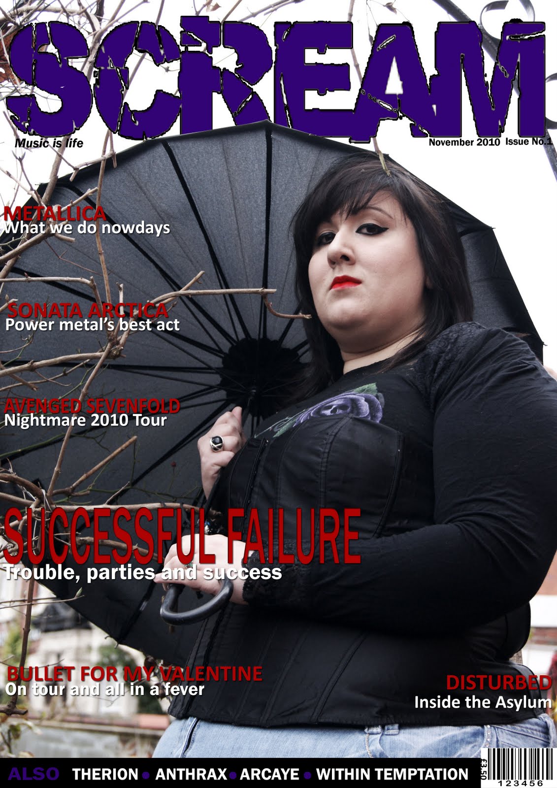
‘I like all the colours and the awesome picture – I think they’re really eye-catching’

‘I really like the colour scheme, the content is very interesting and relevant to the genre and the images are all really eye catching’

‘I like the main picture because it shows that the magazine has attitude, I like the colour scheme but some of the red text needs to be brighter’

This suggests that I have created an atmospheric, eye-catching front cover that grabs the audience’s attention. The content is also mentioned as a good point, as here it is suggested that the coverlines are interesting. The colour scheme is also credited – this may be because I have used the two most popular colours of my target audience; however I have had some criticism that the colours should be brighter, and I would address this if re-making my front cover. 


‘The image is creative with a good mise en scene, I also like the layout of the text and the picture, it all looks really professional’

‘I like the colour scheme on this double page spread, I like that the picture covers all of the pages and blends with the text’

‘I really love the picture – its different, interesting, something you wouldn’t expect to see, it in itself makes me want to read the article!’ 

‘Looks really professional and attractive to the eye’

This suggests that the double page spread stands out and looks professional, therefore attracting the audience. The colour scheme also seems to be a hit, and that may be because I used the second most popular colour found in my questionnaire results as the main colour for the DPS.
It is also said that the picture is interesting, which may also attract the audience 


‘I like the fact you have both features and regulars to make it easier for the audience to find what they want to read, the images are also really good, I especially like the guitars as they seem relevant to the genre you have chosen’ 

‘I like the colour scheme on this contents page, the headline contents stands out a lot with the shadow behind it. I also like the choice of pictures on this page, and then only thing I would change is to have extra bits of information on their own line rather than with the bold headings’

‘I like how the pictures are relevant to the genre and colours on the page and I agree with the above comment with the extra bits being on their own line’

‘Looks like a professional contents page to me’ 

This suggests that my contents page does well at standing out to the audience, that it is easy for them to find the article they want and distinguish between regular and feature articles, that they find the pictures interesting and relevant.
I have had a bit of criticism about the coverlines and sublines being on separate lines, so if I were to produce my contents page again I may consider taking this advice.

Thursday 17 February 2011

Friday 11th February - Wednesday 17th February


I have firstly changed the background image to a new photo I have taken - I have edited this image on Photoshop, first inverting it, then lowering the brightness and heightening the contrast, I then edited the colors so that the brick wall is now a subtle navy blue and then added the effect solarize to it for impact. 

I have also added an extra page as my article was too large to fit onto one page, I used the same brick wall background as on the double page and then added another picture to this page from the photoshoot I did for the double page spread. 

Moreover, I have changed the title so that the word 'INSIDE' spreads across the whole three columns and the words 'THE ASYLUM' is below this in smaller font, with the effects 'drop shadow' and 'shadow' on them.

I have furthermore added a standfirst to my article, as this is a required convention of a magazine article. 
Also, I have added the page numbers to the bottom left and bottom right corners along with the magazine's 'website'. 

During this time I have also slightly edited my contents page. I have changed the background colour behind the word 'contents' to purple (in keeping with the magazine title on the front page), I have also changed the colours behind the titles 'features' and 'regulars' to red (in keeping with the coverlines on the front page). I have also moved the pictured into the centre column rather than the right hand column, to make the page look more interesting and also to further seperate the feature and regular content. Furthermore I have changed my issue date and number to white, and added subsription information and contact information in the top right corner of the page.


Wednesday 16 February 2011

Photos for DP 2

This is the final image for my DPS. I have edited this in many ways, such as inverting the background (when it was black and white) adding a navy blue tint to it and then addinf the effect solarize to it. I like this image as it conveys much attitude, and also relates to the band, not only because of the tshirt, but also because of  a mask, it may suggest that the band is kind of 'insane' but in a fun way, and also the mask is similar to the face of Disturbeds animated 'mascot' or 'logo' the guy, who appears on most of their album covers and in their video for the song 'Land of Confusion'.


This is the final image for the third page of my DPS. It is a part of the brick wall seen in the first image, it has also been inverted (from when it was black and white below), tinted and solarized.


This is my experiment of the wall for the DPS third page in black and white. This would have worked, however it was impossible for the writing to stand out on it, therefore it could not be used. I also think this is not as effective at creating an impact as the much edited wall above.


This was my experiment for the main image with a black and white wall. It cannot be used for the same reasons as above.


This is the original photo which I am going to use for my DPS.

These pictures below are the other pictures I took during my second photoshoot for the DPS. I am not using these for various reasons, mainly because on them either the backgroud isn't right, the models attitude isn't right or their pose isn't right.


Thursday 10 February 2011

Friday 4th Febuary - Thursday 10th Febuary

During this time I have been making amendments to all my production work:


In my contents page I have made a number of changes, such as adding more coverlines, making the word 'contents' bigger, making the page numbers purple, making the issue date and number purple and changing the top right image so that it relates to the front cover.


In my double page spread article I have added the title of the article.


I have decided when it comes to my front cover that I will use purple for my title (so that it stands out more) and the strip and red for my coverlines, I have also changed the coverline about the band 'Disturbed' so that it is the same as the title of my DPS. I have also made it so that my main images umbrella covers part of the title, and made her red lipstick stand out a bit more so that it ties in with the coverlines. I have also made sure that all the writing and shapes in the strip are aligned correctly.

Thursday 3 February 2011

Monday 31st January - Thursday 3rd Febuary


In this time I have edited the picture for the DPS article, I made it slightly bigger using Photoshop so that it goes over onto the first page a little, therefore making the pages link, I also added the filter Fresco to the picture on Photoshop to make the picture look darker and more interesting. 


I have also been editing my front cover image, editing small typos etc. I also changed the main color to red to see its effect. I do think the red is effective, and maybe makes the magazine look less 'girly' to appeal more to the male audience. However, in my questionnaire results, purple was the favorite color of my target audience, although red was second. Therefore, maybe I will experiment with using both red and purple. 


Here is my experimentation of using both purple and red on my front cover, the title is purple and the strip at the bottom also has purple accents. I feel that this does make the title stand out more, however I don't know if the two colors coordinate well enough. 

Friday 28 January 2011

Wednesday 26th January - Friday 28th January

During this time I have been editing my front cover and DPS:

I have changed many things on my front cover, mainly the image, as there was a problem with it due to lack of direct adress.

I have also removed a few coverlines and changed some - Sucessful Failure's subline now reads 'Trouble, parties and success - lead singer Alexa tells all'.

Bullet for my Valentine's subline now reads 'All in a Fever' as before it was too similar to Avenged Sevenfold's subline.

I've also changed the bands in the bottom strip to Therion, Anthrax, Arcaye and Within Temptation.

I have also started editing my DPS. This is it in its first stages with the text added and the drop capital added.

Wednesday 26 January 2011

Photos for front cover image (re-done)

I had to change my front cover image photos as the last ones that I took were inadequate for reasons such as no direct adress and a lack of 'headroom' at the top of the photograph for the magazine title, therefore over the weekend I have taken the photos show in the video below, on eof which will replace my current front cover image:

I like the angle of picture 2 and the attitude my model is conveying, I think that it represents the magazine genre very well, therefore I may use this photo.

I like the camera angle of picture 8, however I don't think it is suitabe for a front cover image, therefore I may use it as a replacement for my current contents page image relating to the main coverline as it no longer connects with the new front cover image pictures.

I like the attitude of picture 10, and it also has very good direct adress, therefore I may use this as my front covr image.

I also like the angle and the attitude of picture 11, I may use this as my front cover image.

Tuesday 25 January 2011

Friday 21st January - Tuesday 25th January

During this time I have been editing my blog and taking new pictures for my front cover image as my first ones were inadequate.
I have also created a video of my new photos (screen grab shown below) to soon be added to this blog.

Thursday 20 January 2011

Wednesday 19th January & Thursday 20th January

I have edited this by firstly adding an issue number underneath the right side of the title along with the issue date.
I have also added a positioning statement 'music is life' underneath the left corner of the title.

Moreover I have removed some of my coverlines as before hand I had too many.

Next I added a 'strip' to the bottom of the page. reduced the size of the bar code and removed the space between the coverlines and the sublines.

And lastly I changed the coverline of the main subline as 'Successful Failure - Gothic metal's new gods' did not suggest the female image.

Tuesday 18 January 2011

Monday 18th January - Tuesday 19th January

During this time I have edited my contents page, double page spread article and front cover a lot:


First I changes the background color of the second page to black, I then changed the color of all the text to white. I have also, as you can see, changed the title to 'Inside the Asylum... Disturbed' as apposed to 'Inside the Asylum The story of Disturbed'. Then I added the name 'Disturbed' in creative text to add a more artistic feel to the presentation.


Next, I added the picture I took for this article to the first page. I may edit this picture at a later date in Photoshop.


I have drastically changed my contents page, I have changed the background color back to white, I have also added the two other contents page pictures, made the numbers purple, added strips at the top in black, purple, then black again. I also added the issue date and number to the top strip also containing the title of the magazine.

Pictures Taken for Double Page Spread Article

build animated gif


I took the first picture (red mask, white background) to connote the name of the band and the title 'Inside the Asylum... Disturbed'. I thought the idea of having my model wear a Halloween mask with a Disturbed tour t-shirt as this would connote a certain 'fun kind of craziness' but also connoting that the article is about the band. 
I like this picture as the angle is very dramatic and effective, creating an imposing feeling for the audience. 

I took the second (skeleton mask) picture to experiment with a different Halloween mask to see the effects it would have. 
I like the angle of this photo, however, not as much as the previous one. I also don't think that the mask used here is as effective as the one used in the previous photo. 

I created the third picture using Photoshop, I edited the contrast of the original picture, cut out the background and created a new one using the paintbrush tool. I may use this as the background is interesting, however I may not use it as it may make my DPS look too 'cluttered'.

Pictures Taken for Contents Page


Friday 14 January 2011

Wednesday 12th January - Friday 14th January

During this time I have been making minor changes to my contents page and double pages spread article such as changing the font size and adding effects to certain pieces of text such as 'drop shadow' in order to make them stand out more.

I have also added a quote from one of the answers my interviewees gave for my article to the centre of the second page of the double page spread show below:


Moreover I have also changed the title so that the beginning of it (Inside the Asylum) is now smaller and turned diagonally, as I thought the original set up of the title looked too long:


Tuesday 11 January 2011

Friday 10th December - Tuesday 11th January

In this time I have done many things, such as finished creating my magazine front cover, almost finished the contents page and half way through creating my double page spread article.

I have also taken the rest of the pictures for my contents page, and the picture for my double page spread article, to be added annotated to this blog at a later date.

The screen grabs below show the full extent of my work on Adobe Photoshop and Quark Xpress

This picture shows my finished front cover image - I have changed the colour of the sublines to white, so that the coverlines and sublines go with the colour scheme of the magazine title perfectly.


This screen grab shows the contents page with just its articles added to it.


This shot show that I have added the word contents to my contents page,with the effect 'drop shadow' on it.
This shot shows that I have added my first picture onto the contents page, with the number f its corresponding article on the bottom right corner of it.


 This shows that I have added the title of the magazine in its distinct font to the page.
This shows that I have added a small image of the front cover of the magazine to the page in between columns 2 and 3


 This shows my double page spread article at its first stage. At this point I had imported the text of the article I'd written in Microsoft Word into Quark, and organized it so that the text split into three columns and fitted onto 1 and a quarter pages on Quark.


Here I have added the title of the article to my double page 'Inside the Asylum ... The Story of Disturbed'.
The below shows how I have changed the background colour of my contents page to black, and have changed the writing all to white. I have also added purple to the drop shadow of the word contents and have added a 'features' and 'regulars' heading to the contents in purple.